
Your Website Is Not a Brochure. It Is a Sales System.
Most sites describe a business instead of winning work. Here's the difference between a brochure and a sales system, and how to rebuild the gap.
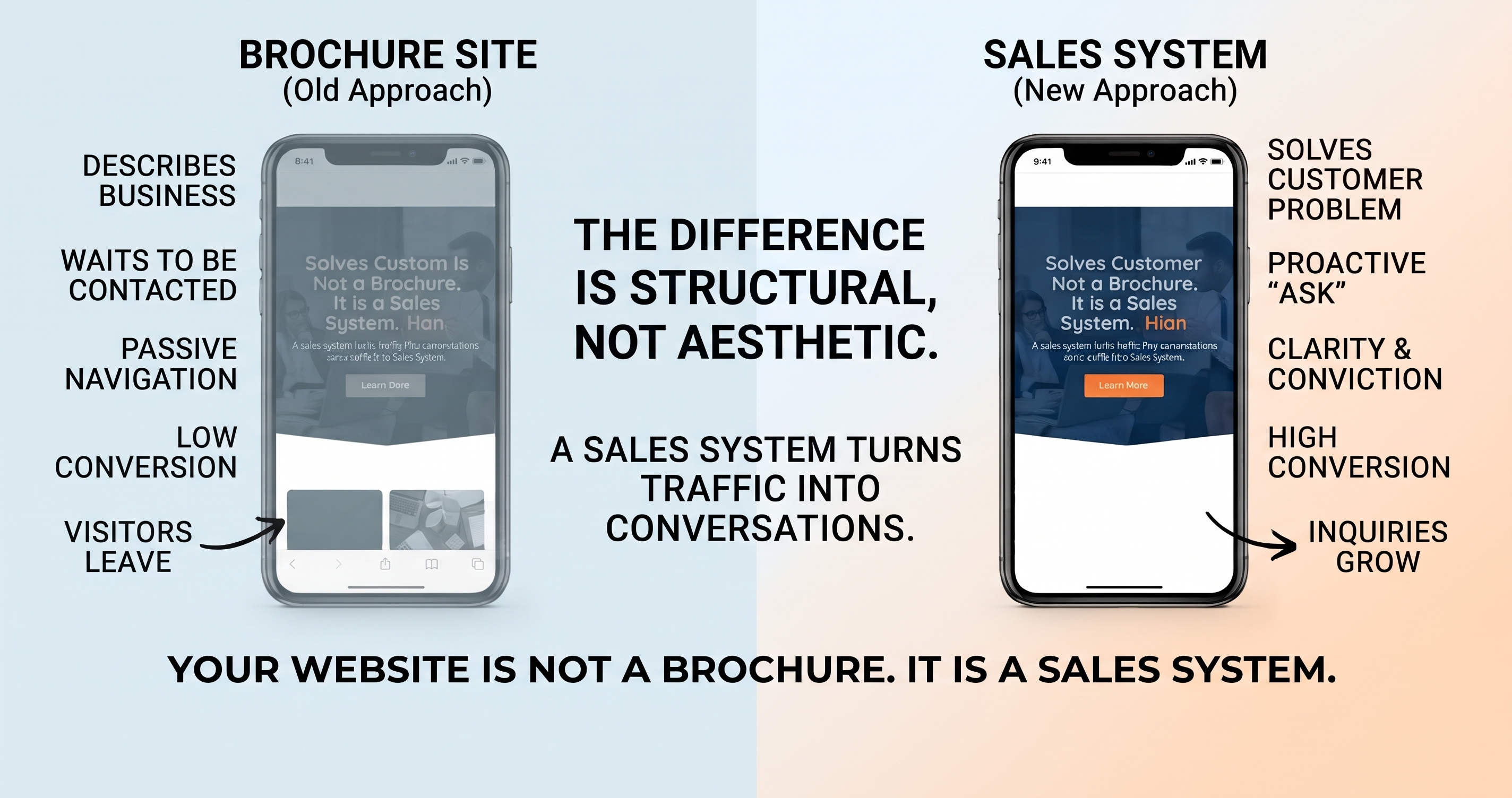
A brochure site describes what you do and waits to be contacted. A sales system is designed around one job: turning the visitor you already have into an inquiry. The difference is rarely visual — it's structural, and it's usually fixable without starting again.
- Most sites lose people by never clearly asking for anything
- One action, repeated, beats three competing ones
- What happens after the form matters as much as the form
Every few weeks someone sends us a website and asks why it isn't working. The site is usually fine. It loads, it looks reasonably current, the photography is decent. Somebody was paid properly to build it and they did what was asked.
It just never asks for anything.
You can read the whole homepage and come away knowing the company was established in 2009, is family owned, and is passionate about quality — without ever encountering a moment that invites you to do something about it. The contact page exists, of course. It's in the navigation, and again in the footer, patiently waiting for someone motivated enough to go looking.
Most visitors are not that motivated. They have a problem and about ninety seconds of patience.
What actually separates the two
The distinction isn't aesthetic. Plenty of beautiful sites are brochures and plenty of plain ones sell well. Three things change:
It answers the visitor before it talks about itself
Someone arriving on a service page has a specific question, and it is almost never “when was this company founded.” It's whether you cover their area, whether you handle their kind of job, roughly what it costs, and how soon you can come. Put those first. The story of the business can wait until they care.
It asks at every depth, not just at the end
People decide at different points. Some are ready from the hero, some need the proof, some need to read the whole page twice. A single action — the same one — should be available wherever they land on that spectrum.
Something happens when they say yes
This is where most rebuilds stop short. A form that drops into an unmonitored inbox has converted nothing; it has merely moved the failure further down the line. The page and the response behind it are one system, which is the whole reason we wrote separately about the first five minutes.
Where the hundred go
It helps to think in terms of what happens to a hundred visitors, because the losses are invisible at every individual step and enormous in aggregate.
Notice where the steepest drop sits. It isn't people failing to find the site, and it isn't people refusing to read. It's the gap between reading and having somewhere obvious to go next — which is entirely within your control and costs nothing to fix beyond the decision to fix it.
Fixing it without starting again
A rebuild is sometimes the right answer, but it's rarely the first one. If the site has traffic and the design isn't actively embarrassing, the cheaper path is usually restructuring what's there.
- Decide the single action. For most service businesses that's a booked call or a quote request. Pick one and let every page carry it.
- Rewrite the first screen of each service page. Lead with the problem you solve and the area you cover. Put the action right there.
- Add proof near the ask, not in a separate section. Reviews, licenses, and recent jobs do their work when they sit beside the decision, not three scrolls away.
- Wire the form to something that responds. Immediately, at any hour, with an actual answer.
- Track it. Inquiries against sessions, by page. Without that number, every further change is a matter of opinion.
Where design still earns its place
None of this is an argument for ugly websites. Design does real work: it establishes credibility in the first seconds, it makes structure legible, and on a phone it decides whether the ask is even visible without pinching and scrolling.
The mistake is treating design as the whole job. A site can be beautiful and still be a brochure — and a brochure is a fixed cost that returns nothing. What you want is something that pays you back every month, quietly, by turning the traffic you already have into conversations. That's the difference between a website build and a system.
Common questions
What makes a website a sales system rather than a brochure?
Do I need a full rebuild to fix this?
How many calls to action should a page have?
Does design still matter?
How do I know if my site is converting badly?
Send us the site you have.
We'll tell you whether it needs a rebuild or a restructure — including when the honest answer is neither.